
It should come as no surprise that businesses are adopting mobile technology, given the rapid growth of mobile users. Your customers really anticipate that your company will have a mobile-friendly website. This is particularly true for an e-Commerce site, where a bad shopping experience might result in people defecting to a rival and spending their money there instead.

Include Direct Requests for Participation – A Call to Action
Your mobile e-commerce site needs to fight off competition from a wide variety of sources, including other applications, messages, games, and phone calls. Remember that a customer’s attention span is already quite limited. Increase the number of calls to action and make them easy to see against the background of the website. The button design needs to have contrasting colors and be large enough to tap without trouble. Be original and artistic, and try to create cool engaging stickers with the help of Picture Outline Maker.
Also, be succinct in your call-to-action language. “Buy Now” and “Add to Basket” buttons are unambiguous and simple.
Connect Your Online Store to Different Social Media Platforms
When it comes to social media platforms, Pinterest and Instagram have emerged as the frontrunners in social selling. If you want increased sales from people using mobile apps, you should connect your online store to these channels. Pinterest’s Rich Pins and Buyable Pins, for instance, provide users with product pricing and availability without requiring them to go through a different website.

Using Shoppable Posts, your company may promote its wares directly on Instagram. Tags bring up a catalog of goods where consumers may browse your feed and switch to the relevant product page on your site to make a purchase. Keep tabs on how many people are coming to your site from Instagram and Pinterest, and use that data to devise promotions and discounts tailored to those platforms for boosted sales from mobile devices.
Enhance Your Website’s User Experience
Shopping on a mobile-friendly e-commerce site isn’t the same as shopping on a regular website. Lighter, quicker, and more intuitive code is essential for any mobile site. Some simple adjustments to the layout may greatly improve the experience of browsing your wares. Develop a minimalistic top navigation menu to enhance your UX and make it easy for consumers to locate what they’re searching for. Some visitors may know precisely what they want, while others might be just exploring, so it’s helpful to include both a search box and a menu choice.
Get Rid of Unnecessary Steps at Checkout
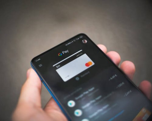
Brands are losing around a quarter of their consumers by adding more steps to the checkout process. Customers may be put off making a purchase if required to create an account or submit more personal information. Another important aspect is the possibility of processing payments from various sources and platforms. Make sure your consumers may use their preferred payment method (Apple Pay, PayPal, Visa Checkout, etc.) while purchasing from you.
Adapt Cool Modern Technology
When people talk about “voice commerce,” they’re referring to a system that uses AI to facilitate online transactions. Here, customers may use their mobile devices (phones and tablets) to do voice-activated product searches. The convenience of voice shopping is enhancing the retail industry. A simple command is all that’s needed. By 2024, it is expected that the value of all transactions conducted over voice will increase to more than $30 billion. Therefore, integrating a voice search will make buying easier for your consumers, and doing so on your website will increase the store’s mobile friendliness.
Fix Up the Picture Quality and Adapt Them to Mobile Devices

Clear, high-resolution product photos are essential if you want to sell to discerning consumers. Moreover, they anticipate that these visuals will load swiftly. If you want your photos to look well and load quickly on a mobile device, you should utilize high-resolution shots properly cropped and scaled.
Display Your Content Using the Latest Software
Flash is kind of outdated for mobile devices and is not supported by iOS or Android versions 4.1 and above. So, use HTML5 to render your content. Additionally, do not include any registration forms that flash up or any in-app adverts. They detract from the experience and bury your content.
Facilitate Access to Relevant Contact Information
Customers need a way to get in touch with a company, be it a toll-free number, an office hours widget, or a map showing them where the nearest branch is located. A better user experience is achieved when this data is readily available to visitors. Make sure that the information is accurate.
Conclusion
The amount of time spent browsing e-commerce sites on mobile devices has surpassed the time people spend in front of desktop computers. Since then, Google has been paying greater attention to user search intent related to mobile phones. If you want to get into the e-commerce sector, you should aim to make a site suitable for portables. Taking this action will help you draw in a large number of customers and propel your company forward significantly.